Kaggle-Survey EDA
Kaggle - EDA
2020 Kaggle Machine Learning & Data Science Survey
The most comprehensive dataset available on the state of ML and data science
https://www.kaggle.com/c/kaggle-survey-2020
Introduction.
처음 해본 Kaggle 프로젝트였습니다. 이미 끝난 대회이지만 퓨쳐스킬을 통해서 배운 EDA 기술을 끌어모아 유의미한 분석을 하는데에 목표를 두고 임했습니다. 퓨쳐스킬에서 푼 다양한 데이터 시각화 기본기 문제들을 다시 뒤적이면서 복습 겸 분석에 도전했습니다.
그럼 대회의 설명부터 읽고 요약을 하겠습니다.
This survey data EDA provides an overview of the industry on an aggregate scale, but it also leaves us wanting to know more about the many specific communities comprised within the survey. For that reason, we’re inviting the Kaggle community to dive deep into the survey datasets and help us tell the diverse stories of data scientists from around the world.
데이터 사이언티스트들을 주제로 다양한 얘기를 할 수 있도록 EDA를 하는 것이 이번 대회의 목표입니다.
The challenge objective: tell a data story about a subset of the data science community represented in this survey, through a combination of both narrative text and data exploration. A “story” could be defined any number of ways, and that’s deliberate. The challenge is to deeply explore (through data) the impact, priorities, or concerns of a specific group of data science and machine learning practitioners. That group can be defined in the macro (for example: anyone who does most of their coding in Python) or the micro (for example: female data science students studying machine learning in masters programs). This is an opportunity to be creative and tell the story of a community you identify with or are passionate about!
조사에 참여한 데이터 사이언티스트 커뮤니티의 일부에 대해 이야기를 데이터와 적절한 말과 데이터 탐색을 통해 풀어나가야합니다. 이 대회를 내가 포함되있거나 관심이 있는 분야 커뮤니티에 대한 이야기를 창의적으로 할 수 있는 기회를 가질 수가 있게 됩니다.
마지막 구절을 듣고, ‘나와 비슷한 사람들을 분석하면, 내가 뭘 해야 먹고 살 수 있을 지, 또 잘 먹고 살 수 있을 지 알 수 있지 않을까?’ 하는 생각이 들어서 그것에 초점을 두고 분석을 시작하게 됐습니다.
Import module, read data.
먼저 EDA에 사용할 모듈들을 import 하고, data를 읽어들이는 과정입니다.
import pandas as pd
import numpy as np
import matplotlib.pyplot as plt
import matplotlib.ticker as ticker
import seaborn as sns

data = pd.read_csv('/kaggle/input/kaggle-survey-2020/kaggle_survey_2020_responses.csv')
처음 해보는 kaggle 과제라 처음에는 colab에서 문제를 풀고 노트를 그대로 옮기는 식으로 시작했습니다. kaggle API 토큰을 받아서 데이터를 다운로드하는 과정을 거쳤지만 실제로 kaggle 노트북 작성에 들어가니 기존에 built-in 되어있는 코드를 이용해 데이터를 받을 수 있었고 바로 읽어올 수 있었습니다.
우선 읽어온 데이터가 어떤 모습을 하고 있나 개략적으로 훑어보기로 했습니다.
data.head()
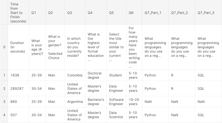
DataFrame의 열에는 질문 번호로 인덱싱이 되어있고, 복수 선택지가 있는 경우는 _Part_#꼴로 되어있는 모습을 알 수 있었습니다.
Analysis
저는 저의 상황과 비슷하게 석사과정을 거친 남자들의 정보만 가지고 분석을 하기로 했습니다. 그리고 그런 사람들의 나이는 어떤식으로 분포하고 있을까에 대해서 가장 먼저 알고 싶었습니다.
df_similar_to_me = data[(data["Q2"] == "Man")  & (data["Q4"] == "Master’s degree")]

age_group = df_similar_to_me['Q1'].value_counts().sort_index().astype(np.int64)

idx = age_group.index

fig, ax = plt.subplots(figsize=(15, 8))
ax.bar(idx, age_group, facecolor='lightgray')
ax.set_xlabel('Age group', fontsize=14, fontweight='bold', color='gray', labelpad=12)
ax.set_ylabel('Population', fontsize=14, fontweight='bold', color='gray', labelpad=12)

for p in ax.patches:
    left, bottom, width, height = p.get_bbox().bounds
    if height == 1529:
        ax.annotate(height.astype(np.int64), (left+width/2, height+30), ha='center', color='k', fontweight='bold')
    else:
        ax.annotate(height.astype(np.int64), (left+width/2, height+30), ha='center', color='k')

ax.patches[2].set_facecolor('yellow')
ax.patches[2].set_linewidth('3')
ax.patches[2].set_edgecolor('darkorange')
value_counts()를 통해 age열에 고유한 값들을 반환하고 그 값들을 sort_index()를 통해 index에 따라 오름차순으로 sort 했습니다. 그리고 matplotlib의 bar 그래프를 통해 어떤 분포를 하고 있는 지 알아보고 annotate를 해 구체적인 값을 명시했습니다.
그래프가 그려지고 나서 가장 큰 값을 차지하는 25~29 나이그룹에 강조를 하기위해 색을 입혔습니다.
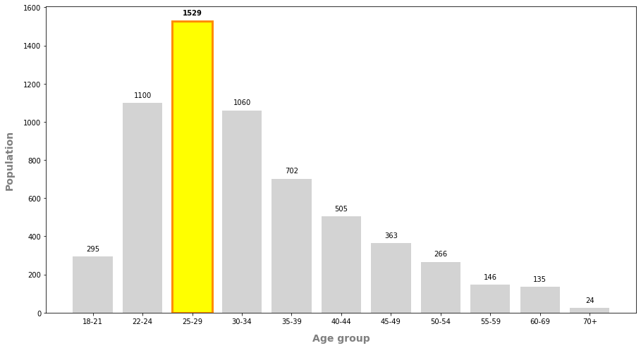
나이대를 확인하니 약간의 안도감을 느끼고, 이 사람들은 그럼 어떤 일을 하고 있을까 알아보기로 했습니다.
current_role = df_similar_to_me['Q5'].value_counts().sort_index().astype(np.int64)

fig, ax = plt.subplots(figsize=(15, 8))
ax.bar(current_role.index, current_role, facecolor='lightgray')
ax.set_xlabel('Current role', fontsize=14, fontweight='bold', color='gray', labelpad=12)
ax.set_ylabel('Population', fontsize=14, fontweight='bold', color='gray', labelpad=12)

ax.tick_params(axis='x', rotation=90, labelsize=10, length=5)

for p in ax.patches:
    left, bottom, width, height = p.get_bbox().bounds
    ax.annotate(height.astype(np.int64), (left+width/2, height+10), ha='center', color='k', fontweight='bold')


ax.patches[5].set_facecolor('yellow')
ax.patches[5].set_linewidth('3')
ax.patches[5].set_edgecolor('darkorange')

ax.patches[6].set_facecolor('lime')
ax.patches[6].set_linewidth('3')
ax.patches[6].set_edgecolor('seagreen')

ax.patches[9].set_facecolor('skyblue')
ax.patches[9].set_linewidth('3')
ax.patches[9].set_edgecolor('dodgerblue')

ax.get_xticklabels()[5].set_color('darkorange')
ax.get_xticklabels()[5].set_fontweight('bold')
ax.get_xticklabels()[6].set_color('seagreen')
ax.get_xticklabels()[6].set_fontweight('bold')
ax.get_xticklabels()[9].set_color('dodgerblue')
ax.get_xticklabels()[9].set_fontweight('bold')
코드 자체는 위와 동일한 구조로, 직업에 따라 분류하기 위해 'Q5' 열을 사용한 점만 다릅니다. 이번에는 제가 관심있는 3가지 직업, Data Scientist, Machine Learning Engineer, Reserach Scientist의 결과값을 강조했습니다.
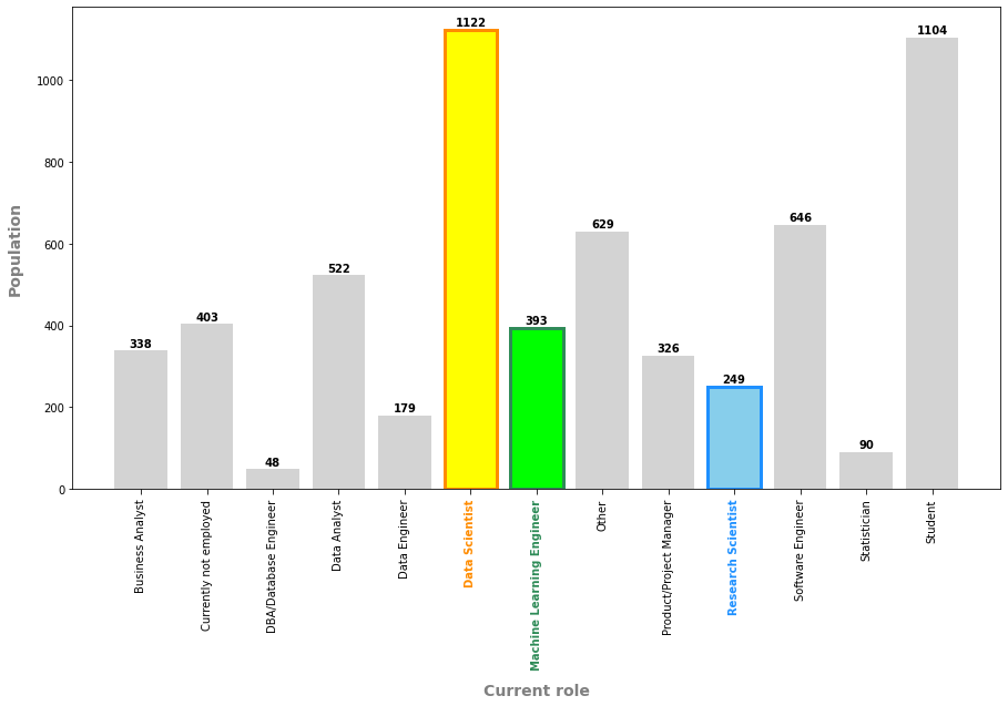
이제 더 범위를 좁혀 석사 남자중에서 이 3가지 직업을 가지는 데이터만 살펴보기로 했습니다. 이 3가지 직업을 가진 사람들은 얼마만큼의 코딩, 프로그래밍 경력이 있는지 볼 수 있으면 내가 얼마나 더 열심히 많이 경험을 해야할 지 알 수 있을거라고 생각했습니다.
top_3_jobs = df_similar_to_me[(df_similar_to_me["Q5"] == "Data Scientist") |
                              (df_similar_to_me["Q5"] == "Machine Learning Engineer") |
                              (df_similar_to_me["Q5"] == "Research Scientist")]

top_3_jobs.head()

top_3_jobs['count'] = 1

jobs_exp = pd.pivot_table(top_3_jobs, index=['Q6'], columns=['Q5'], values='count', aggfunc='sum').reindex(['1-2 years', '3-5 years', '5-10 years', '10-20 years', '20+ years'])

jobs_exp.head()

fig, ax = plt.subplots(figsize=(5,12))
sns.heatmap(jobs_exp, linewidths=2.5, annot=True, annot_kws={"size": 10, "fontweight": 'bold'}, cmap="Greens", fmt="d")
ax.set_ylabel('Experience in programming',fontsize=14, fontweight='bold', color='gray', labelpad=12)
ax.set_xlabel('Current Jobs',fontsize=14, fontweight='bold', color='gray', labelpad=12)
top_3_jobs['count'] = 1 라는 코드를 추가했습니다. 이렇게 하면 바로 뒤에 따라나오는 jobs_exp = pd.pivot_table(~)에서 count로 sum을 하여 직업당 경험년수에 따른 인원 수를 셀 수 있습니다. 그리고 표를 보여주듯이 시각화를 하기위해 heatmap을 사용했습니다.
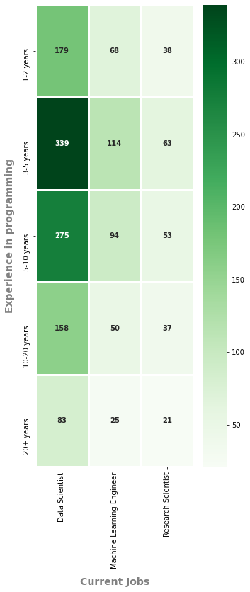
대충 얼마만큼의 경험이 있어야 하는지 대략적으로 알게 되고 더 열심히 해야 쓸모가 있겠구나 라고 생각했습니다. 그러면 몇개의 언어를 다룰 수 있어야 하는지, 무슨 언어를 알아야 하는지도 알아보겠습니다.
lang_sum = top_3_jobs.loc[:,'Q7_Part_1':'Q7_OTHER'].count(axis=1).values

top_3_jobs['lang_sum'] = lang_sum.astype(np.int64)

g = sns.catplot(data=top_3_jobs, x='Q6', y='lang_sum', order=['1-2 years', '3-5 years', '5-10 years', '10-20 years', '20+ years'],
            kind='violin', inner='stick', palette='pastel')

g.set_xlabels('Experience in coding', fontsize=14, fontweight='bold', color='gray', labelpad=12)
g.set_ylabels('Number of languages', fontsize=14, fontweight='bold', color='gray', labelpad=12)

g.axes[0][0].axhline(2, ls='-', color='dodgerblue', linewidth=3)
g.axes[0][0].axhline(3, ls='-', color='dodgerblue', linewidth=3)
우선 다룰 줄 아는 언어의 갯수를 새로운 column으로 추가해주고 바이올린 플롯을 그려봤습니다.
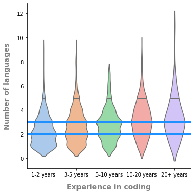
경력에 상관없이 보통 2~3개의 언어를 다룰 줄 아는 사람이 가장 많고 경력이 긴 집단에서는 10개 이상의 언어를 다룰 수 있는 사람들도 있긴 했습니다.
df = pd.DataFrame(top_3_jobs.loc[:,'Q7_Part_1':'Q7_OTHER'])

df_2 = df.notnull().astype('int')
df_2 = df_2.append(df_2.agg("sum"), ignore_index=True)

lang_group = df_2.iloc[-1,:]
idx = ['Python', 'R', 'SQL', 'C', 'C++', 'Java', 'Javascript', 'Julia', 'Swift', 'Bash', 'MATLAB', 'None', 'Other']

fig, ax = plt.subplots(figsize=(15, 6))
ax.bar(idx, lang_group, facecolor='lightgray')
ax.set_xlabel('Language', fontsize=14, fontweight='bold', color='gray', labelpad=12)
ax.set_ylabel('Recommendations', fontsize=14, fontweight='bold', color='gray', labelpad=12)
ax.set_title('First Language to learn for aspiring data scientist', fontsize=14, fontweight='bold')

for p in ax.patches:
    left, bottom, width, height = p.get_bbox().bounds
    if height == 1626 or height == 861:
        ax.annotate(height.astype(np.int64), (left+width/2, height+30), ha='center', color='k', fontweight='bold')
    else:
        ax.annotate(height.astype(np.int64), (left+width/2, height+30), ha='center', color='k')

ax.patches[0].set_facecolor('yellow')
ax.patches[0].set_linewidth('3')
ax.patches[0].set_edgecolor('darkorange')

ax.patches[2].set_facecolor('yellow')
ax.patches[2].set_linewidth('3')
ax.patches[2].set_edgecolor('darkorange')
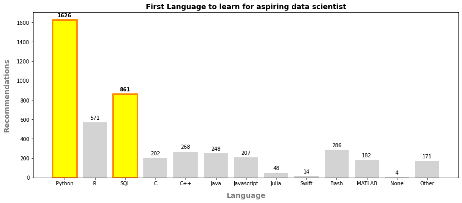
가장 많이 배우기로 추천하는 언어들을 살펴보니, Python과 SQL이 꽤나 앞서고 있었습니다. 운 좋게도 Python으로 코딩을 하고 있어서 다행이네요.
직업을 얘기하면서 돈 얘기를 빼놓을 수 없습니다.
salary = top_3_jobs.iloc[:,118].value_counts().astype(np.int64)
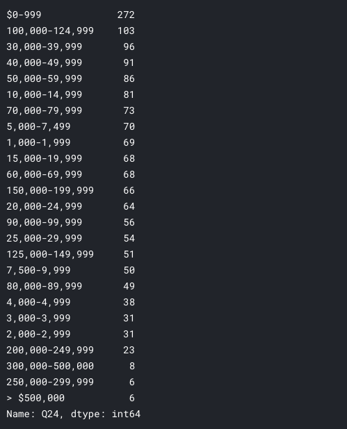
해당 월급을 받는 사람의 인원을 bar 그래프로 그려도 좋지만, 경험에 따라 얼마나 연봉이 변하는 지 알고 시었습니다. 위와 같이 series를 출력해보니 index에 ‘-‘ 도 있고 ‘> $’ 가 있는 경우도 있어서 정규표현식을 사용하려고 했지만 아직 실력이 부족해 일일이 하나씩 빼주기로 했습니다.
salary.index = [i.replace(',','') for i in salary.index]

salary.index = [i.replace('$','') for i in salary.index]

salary.index = [i.replace('> ','') for i in salary.index]

new_index = {}
for i in salary.index:
    mid_point = i.find('-')
    left_num = int(i[:(mid_point)])
    right_num = int(i[(mid_point+1):])
    new_index[i] = (left_num+right_num)/2

new_index
차례대로 쉼표, 달러기호, ‘> ‘ 표시를 제외하고 new_index라는 딕셔너리를 만들어 각 금액대의 (표시된) 중간값, 평균값을 선택하기로 했습니다. 딕셔너리로 만든 이유는 과거의 index와 해당하는 중간값을 같이 가지고 사용할 수 있겠다는 생각이 들어서였습니다.
exp_comp = pd.pivot_table(top_3_jobs, values='count', index=['Q6'], columns=['Q24'], aggfunc=np.sum)

new_col = list(new_index.values())

exp_comp.columns = new_col

exp_comp.fillna(0, inplace=True)

exp_comp

exp_comp['avg_income'] = 0
v2 = np.array(exp_comp.columns[:-1])

for i in range(0,7):
    v1 = np.array(exp_comp.iloc[i, :-1])
    sum = np.sum(v1)
    avg_income = np.dot(v1, v2) / sum
    exp_comp.iloc[i,-1] = round(avg_income,2)

q6_order = ['I have never written code', '< 1 years', '1-2 years', '3-5 years','5-10 years', '10-20 years', '20+ years']

exp_comp = exp_comp.reindex(q6_order)

fig, ax = plt.subplots(figsize=(15, 6))
ax.plot(exp_comp.index, exp_comp['avg_income'], color = 'dodgerblue', linewidth=2.5, linestyle='--')
ax.bar(exp_comp.index, exp_comp['avg_income'], facecolor = 'lightgray', edgecolor='black')
ax.set_xlabel('Experience in coding', fontsize=14, fontweight='bold', color='gray', labelpad=12)
ax.set_ylabel('Average yearly compensation', fontsize=14, fontweight='bold', color='gray', labelpad=12)
결국엔 new_index의 value값만 사용하게 됐습니다. exp_comp를 만들어 열을 교체하고 avg_income 이라는 열을 만든뒤에 평균을 (가격대의 중간값(new_col) * 인원 수) / 인원수총합으로 계산했습니다.
그리고 아래와 같이 막대그래프와 직선그래프를 함께 그렸습니다. 사실 연속데이터가 아니기 때문에 정확한 직선이라고 할 수는 없지만 추세를 알고 싶었기에 아래와 같이 그렸습니다.
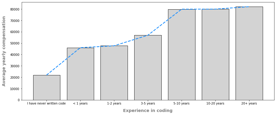
결과적으로는 경험이 많을수록 연봉이 는다는 것을 알 수 있었습니다.
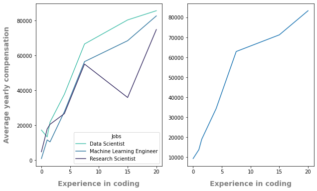
위의 직선을 또 다른 방법으로 그리면서 각 직업별로는 어떻게 차이가 있을까 궁금해졌습니다.
year_job_salary = top_3_jobs[["Q6", "Q5", "Q24"]]

new_salary_list = list(new_index.values())

old_salary_index = top_3_jobs.iloc[:,118].value_counts().astype(np.int64)

old_salary_list = list(old_salary_index.index)

idx_map = dict(zip(old_salary_list, new_salary_list))

year_job_salary = year_job_salary.replace({"Q24": idx_map})

q6_order = ['I have never written code', '< 1 years', '1-2 years', '3-5 years','5-10 years', '10-20 years', '20+ years']

integer_q6 = [0, 1, 1.5, 4, 7.5, 15, 20]

q6_dict = dict(zip(q6_order, integer_q6))

year_job_salary = year_job_salary.replace({"Q6": q6_dict})

year_job_salary.fillna(0, inplace=True)

fig, axes = plt.subplots(nrows=1, ncols=2, figsize=(10, 6))
axs = axes.ravel()
palette = sns.color_palette("mako_r", 3)

sns.lineplot(data=year_job_salary, x="Q6", y="Q24", hue="Q5", ci=None, palette=palette, ax=axs[0])
axs[0].legend().set_title('Jobs')
axs[0].set_xlabel('Experience in coding', fontsize=14, fontweight='bold', color='gray', labelpad=12)
axs[0].set_ylabel('Average yearly compensation', fontsize=14, fontweight='bold', color='gray', labelpad=12)

sns.lineplot(data=year_job_salary, x="Q6", y="Q24", ci=None, ax=axs[1])
axs[1].set_ylabel('')
axs[1].set_xlabel('Experience in coding', fontsize=14, fontweight='bold', color='gray', labelpad=12)
프로그래밍 경험, 직업, 연봉범위로 이루어진 데이터 프레임을 가지고 기존에 했던 것 처럼 우선 연봉범위를 실수값으로 바꿨습니다. 그리고 경험 또한 평균값을 선택해서 새롭게 인덱싱을 했습니다. 그리고 NaN값을 0으로 바꿔준 뒤 seaborn의 hue를 이용해 그래프를 그렸습니다.
Conclusion
Python 기반으로 진득하게 경력 쌓다보면 금세 고연봉자가 될 수 있다는 결론을 내릴 수 있었습니다.
Thoughts
데이터에서는 연봉 부분은 0~999$를 버는 사람이 가장 많다는 것이 잘 이해가 되지 않았는데 아마 무소득자, 학생등도 포함이 되있어서 그런건가 싶네요.
EDA를 처음 해봐서 많이 어려웠습니다. 내가 뭘 표현하고 싶은지, 뭘 표현할 수 있는지 생각을 우선적으로 하고 임해야겠다는 생각이 많이 들었습니다. 범주형 데이터가 많아서 너무 막대그래프에서 벗어나질 못하는 것 같아서 억지로 선 그래프도 그려봤습니다.
EDA를 시작하기 전에 데이터를 훑어보며 질문 만들기(A와 B가 관련이 있을까?)
질문에 답을 할 수 있는 방향으로 분석하기(A가 많아지면 B도 커지는구나.)
추가적인 질문 만들기(항상 많아지는 건 아닌 것 같은데 왜 그럴까? 다른 요인이 있을까?)
질문에 답을 할 수 있는 방향으로 분석하기(C가 많아지면 B는 적어지는구나.)
와 같은 과정으로 계속 연습을 해봐야겠습니다.
어렵고 반복적인 과정이였지만 무언가 눈에 보이는 걸 만들 수 있다는 점이 재밌었습니다. 다음에는 더 재밌는 자료로 아니면 이 데이터를 가지고 새로운 분석을 꼭 해봐야겠습니다.
Leave a comment